Contacts Section
The Contacts row on the Dashboard gives you a snapshot of your contact base — headline counts, how contacts are being acquired, and growth trends over time. All three widgets share the global date range set in the header.
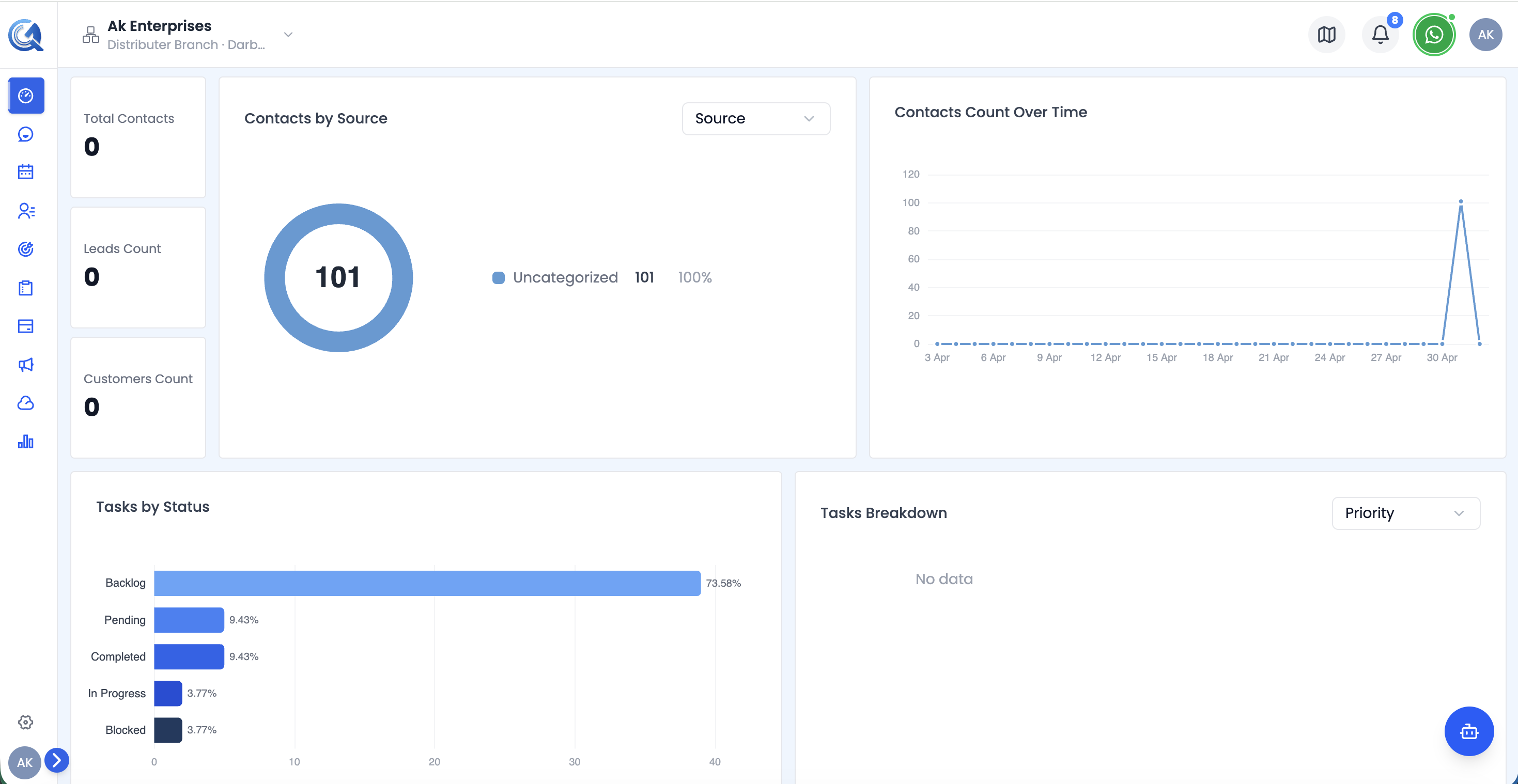 The Contacts and Tasks rows showing KPI cards, source chart, growth chart, and task status widgets.
Contacts KPI Cards
The leftmost column shows three stacked metric cards:
| Card | What it measures |
|---|---|
| Total Contacts | All contacts in the system within the selected period |
| Leads | Contacts tagged as leads |
| Customers | Contacts tagged as customers |
Contacts by Source Chart
The centre widget is a pie chart showing how contacts are distributed across acquisition sources — for example, organic search, paid ads, referrals, social, or manual entry.
Use this chart to identify which acquisition channels are bringing in the most contacts during the selected period.
Contacts Over Time Chart
The rightmost widget is a line/area chart showing how your total contact count has grown day by day within the selected date range.
Tasks Section
Below the Contacts row, two widgets cover task metrics:
Tasks by Status
A horizontal bar chart showing the number of tasks in each status bucket:
- Backlog
- To Do
- Pending
- In Progress
- Completed
- Blocked
Each bar also shows the percentage share of that status out of all tasks.
Tasks Breakdown Chart
A companion chart providing an additional breakdown or distribution view of task activity within the date range.