Dashboard Overview
The Dashboard is your central command centre — a single screen that aggregates live metrics from every service in Quantixone: Contacts, Tasks, Opportunities, Conversations, Calendar, Media Storage, and Forms. All widgets respond to a shared date range, so every number you see reflects the same period.
Navigating to the Dashboard
From the main navigation, click Dashboard. The page loads immediately with a default date range of the last 30 days.
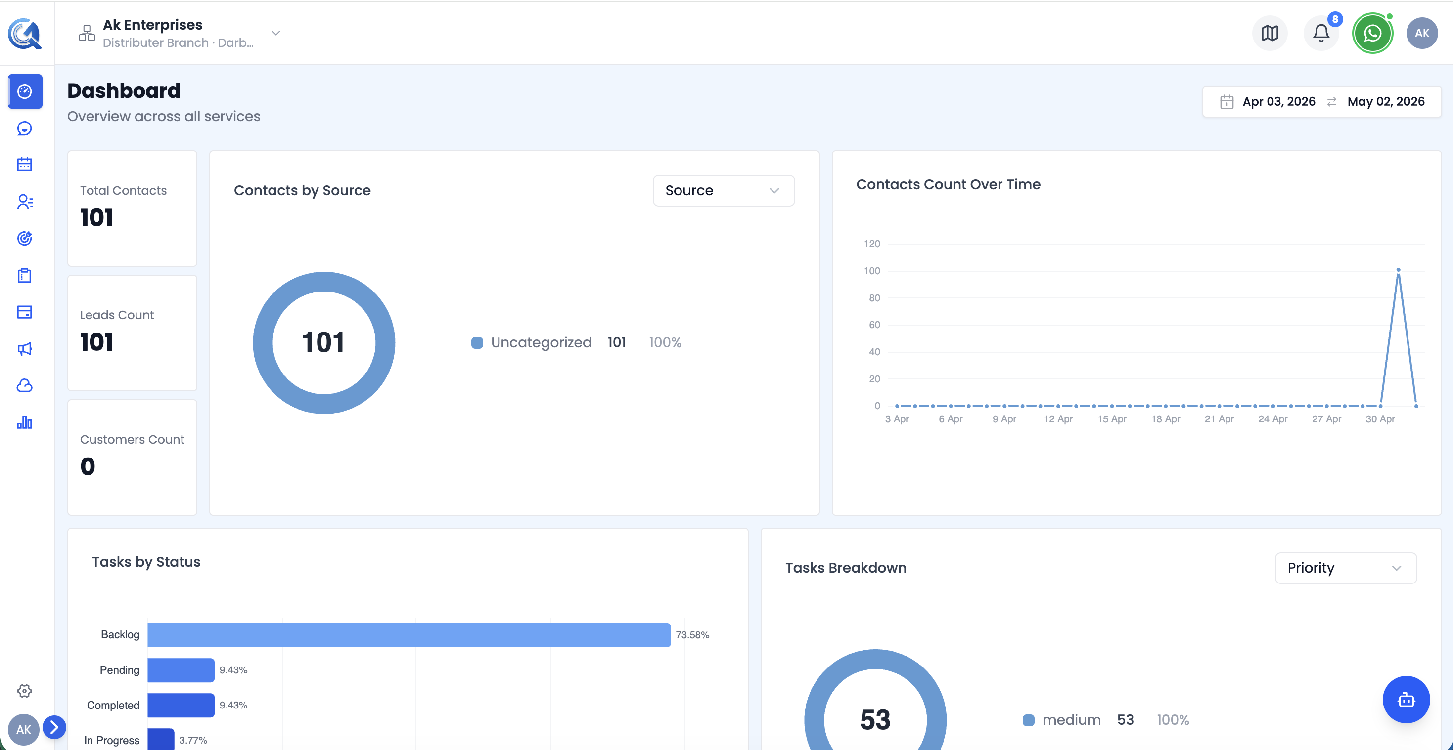 The Dashboard shows live metrics across all services in one scrollable page.
Date Range Picker
Every widget on the Dashboard is date-aware. Use the Date Range Picker in the top-right corner to change the period for all widgets simultaneously.
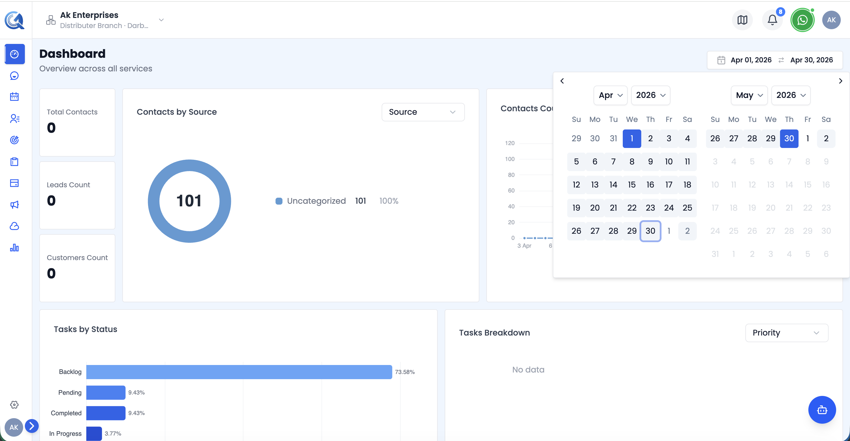 Select a start and end date. All charts and KPI cards update instantly.
- The picker shows two months side-by-side for easy range selection.
- Future dates are disabled.
- The default range is today minus 29 days → today (30 days total).
Dashboard Layout
The dashboard is organised into vertical rows, each focused on a service:
| Row | Widgets |
|---|---|
| Contacts | KPI cards, Contacts by Source chart, Contacts Over Time chart |
| Tasks | Tasks by Status chart, Tasks Breakdown chart |
| Opportunities | Status donut, Value bar chart, Pipeline Funnel |
| Conversations | Channel distribution chart, Conversation KPIs, Message KPIs |
| Calendar | Daily appointment volume chart |
| Media & Forms | Media Storage donut, Forms bar chart |
Video Walkthrough
Watch the complete walkthrough below.