Template Builder
The Template Builder is a visual drag-and-drop editor for creating HTML email templates. No coding required — drag components onto a canvas, configure each one, and publish when ready.
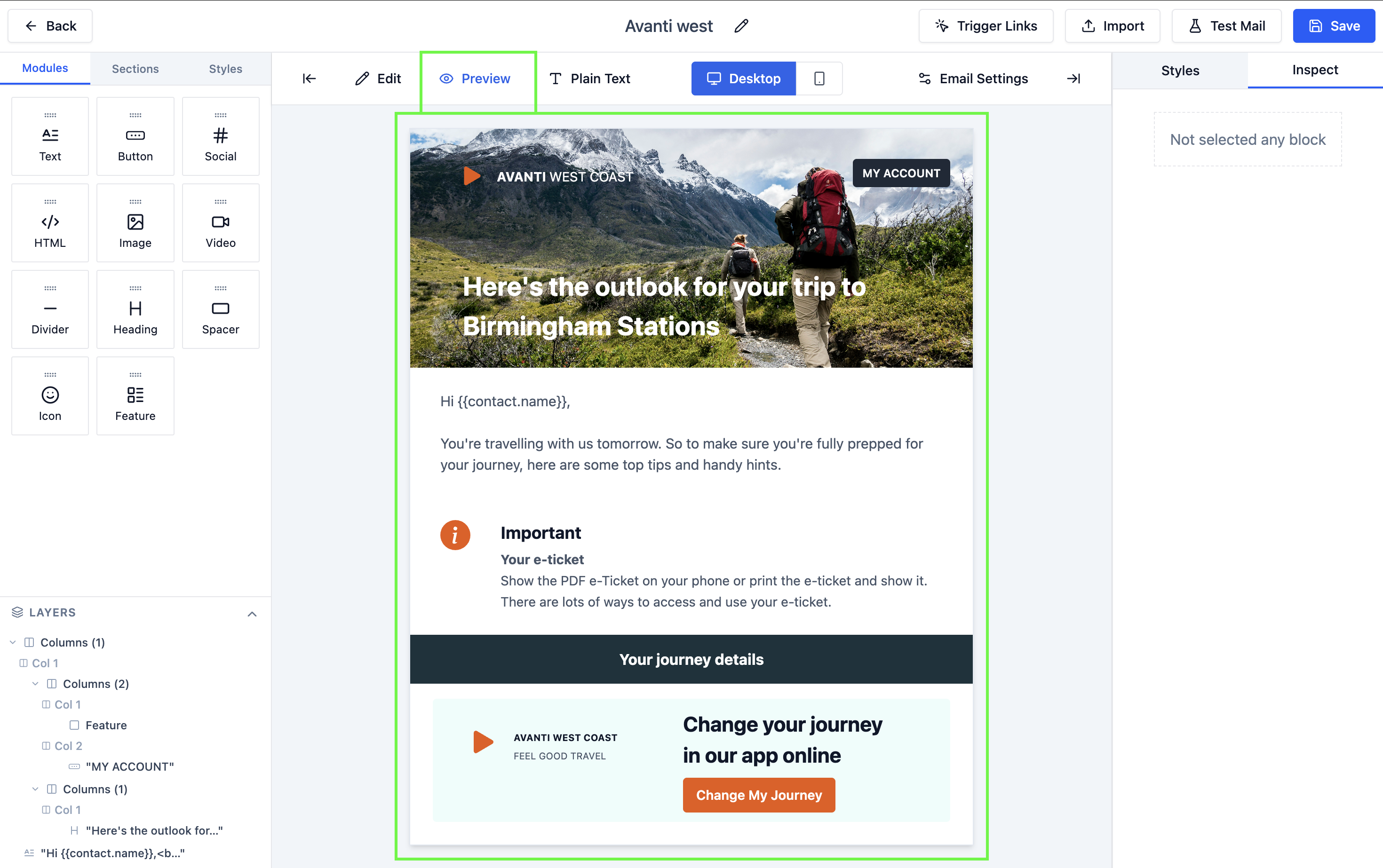
Builder Layout
The builder has three main panels:
| Panel | Location | Purpose |
|---|---|---|
| Component Palette | Left | Drag components from here onto the canvas |
| Email Canvas | Center | Visual representation of your email |
| Settings Panel | Right | Configure the selected component's properties |
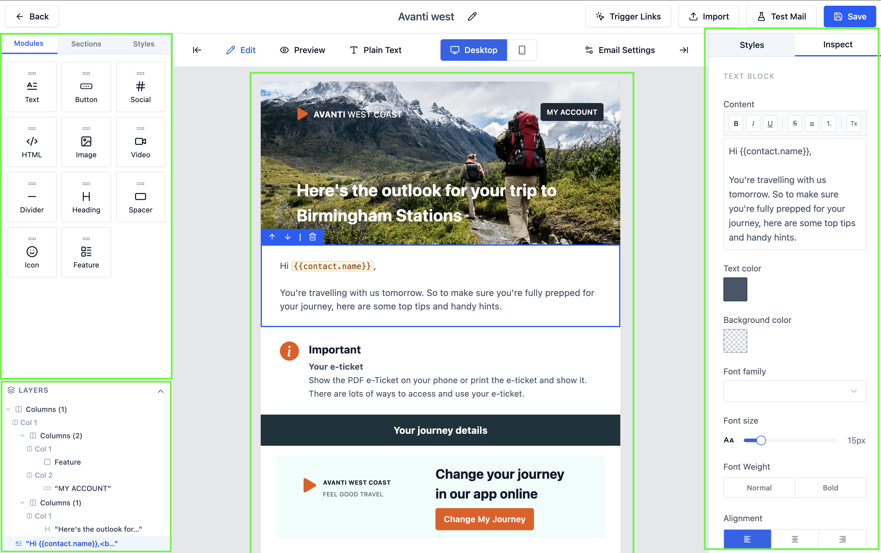 The three-panel layout of the template builder.
Available Components
Drag any of the following components from the palette onto the canvas:
| Component | Description |
|---|---|
| Section | A full-width horizontal block that holds other components |
| Column Layout | 1, 2, or 3 column grid inside a section |
| Text | Rich text block with font, size, color, and alignment controls |
| Image | Inline image with alt text and link-on-click support |
| Button | Call-to-action button with custom label, URL, and color |
| Divider | Horizontal rule for visual separation |
| Spacer | Blank vertical space for padding between sections |
| HTML Block | Raw HTML for advanced custom layouts |
The HTML Block component accepts raw HTML and CSS. Use it only if you need custom layouts that the standard components can't produce. Malformed HTML inside a block can break the surrounding email layout.
 All available components in the palette.
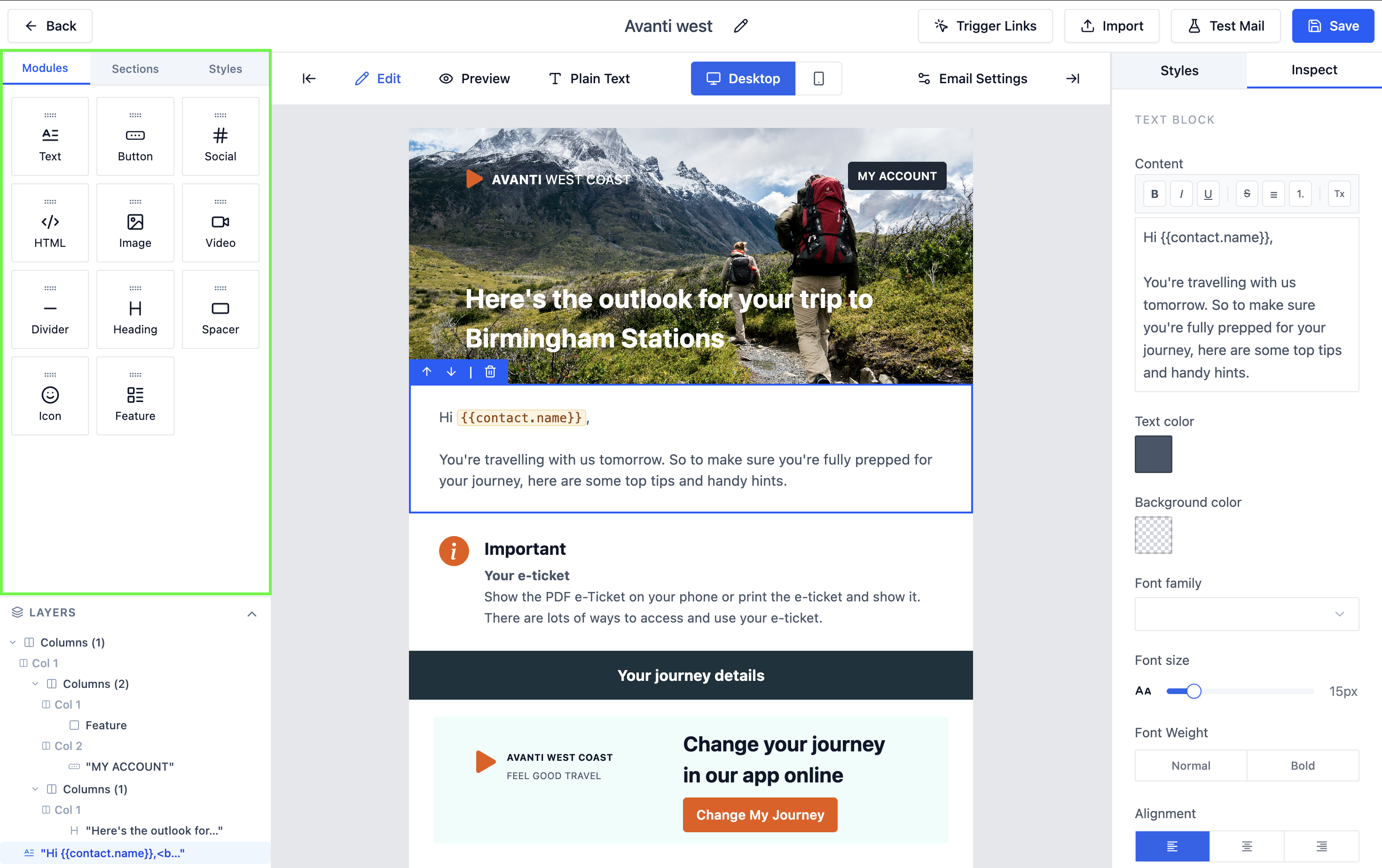
Configuring Components
Click any component on the canvas to select it. The settings panel on the right updates to show that component's options:
Text Component Settings
- Font family, size, weight, and color
- Alignment (left, center, right)
- Line height and letter spacing
- Insert variables using
{{ }}syntax
Image Component Settings
- Upload image or enter a URL
- Alt text for accessibility
- Link URL (click to navigate)
- Width and alignment
Button Component Settings
- Button label text
- Destination URL
- Background and text color
- Border radius and padding
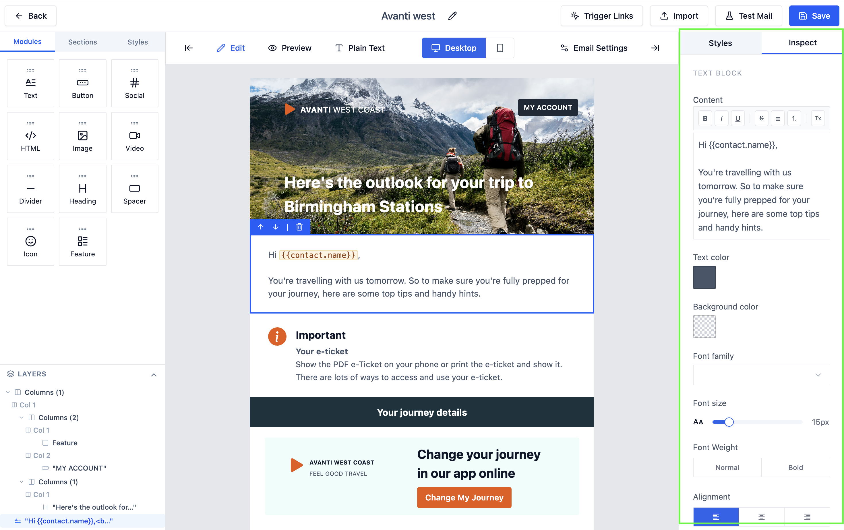 Configure a button's label, URL, and styling in the settings panel.
Reordering Components
Drag any component up or down on the canvas to change its position. A blue insertion line shows where it will land.
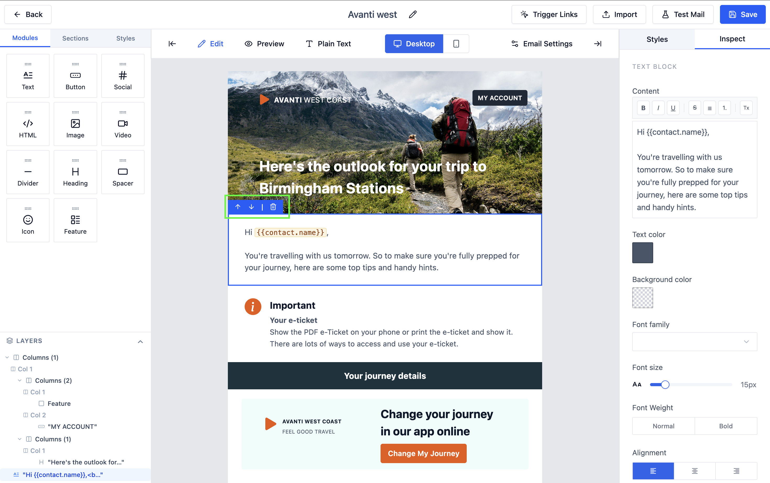 Drag components to reorder them in the email.
Deleting a Component
Click the Delete (trash) icon that appears in the top-right corner of a selected component to remove it.
Preview
Click Preview in the toolbar to see a rendered HTML preview of the email in a modal. This shows exactly how the email will look in a recipient's inbox.
 Preview the email before publishing.
Plain Text Version
QuantixOne automatically generates a plain text fallback from your HTML template. Click Plain Text in the toolbar to review or edit it.
Test Send
Email clients render HTML differently. Use Send Test to check your template in Gmail, Outlook, and Apple Mail before publishing. What looks correct in the builder preview may render differently in a real inbox.
Click Send Test to send a test version of the template to your own email address. This lets you verify rendering in a real inbox before using the template.
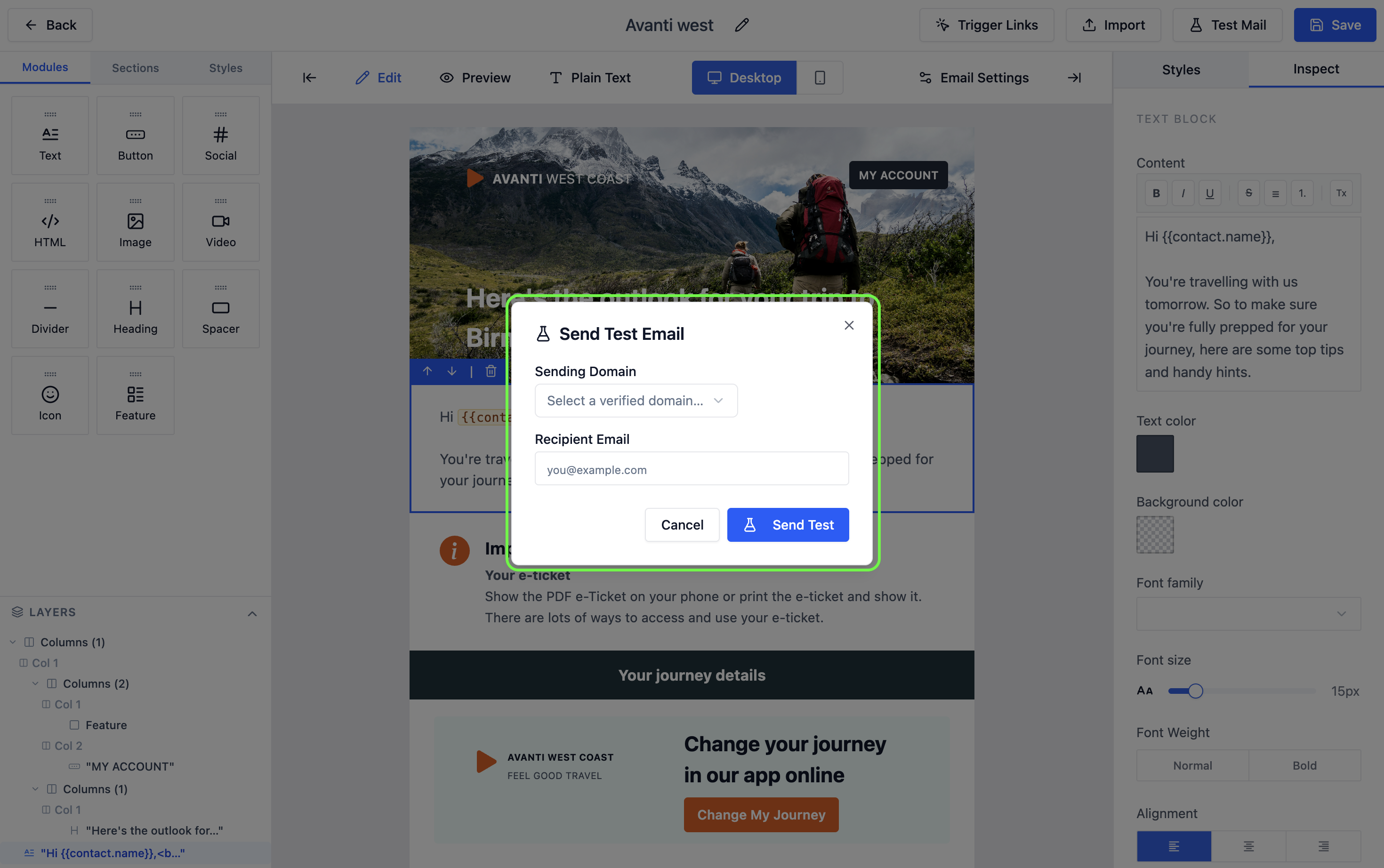 Enter your email address to receive a test send.