Calendar Report
The Calendar report shows booking activity over time and how appointment load is distributed across your team.
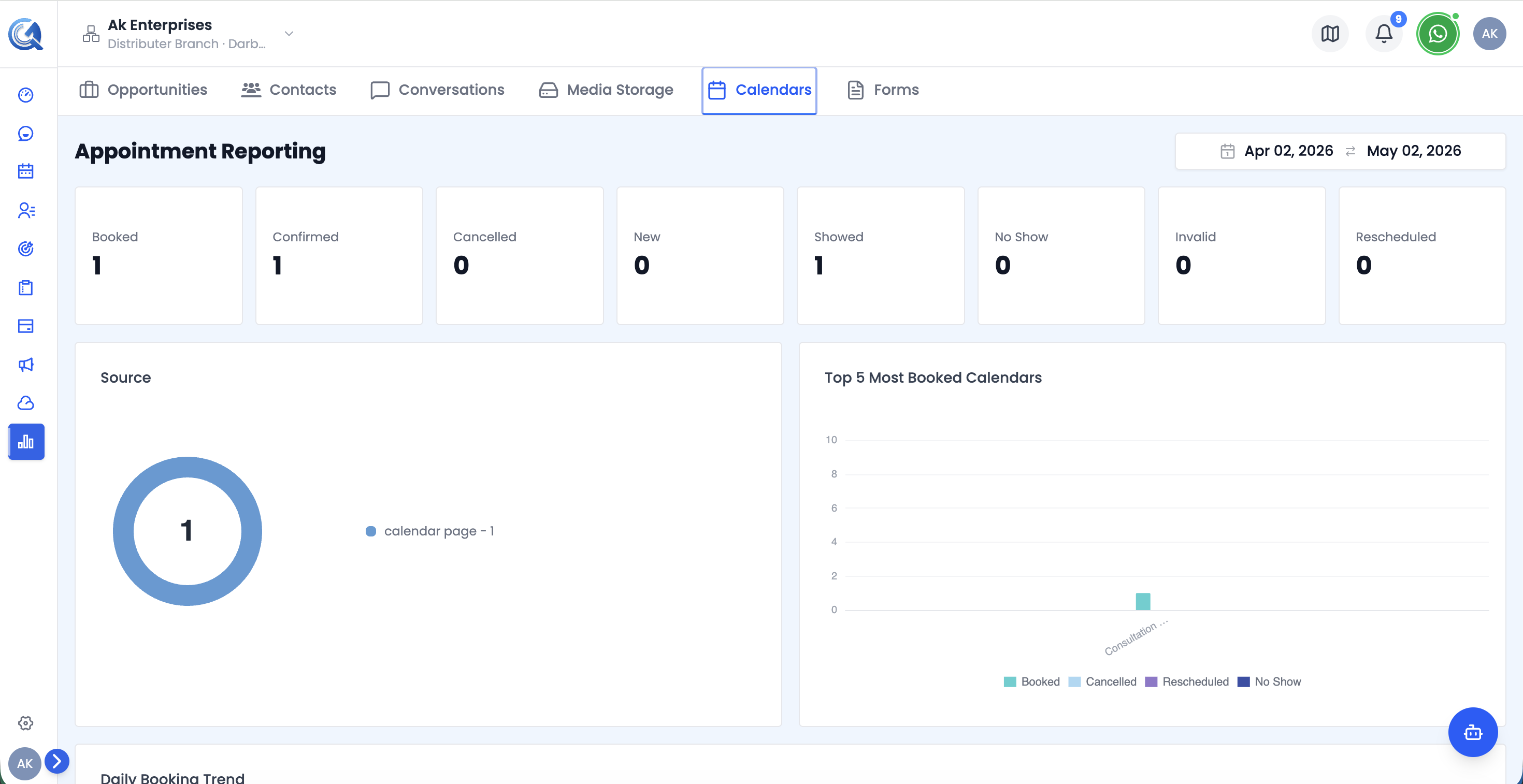 Top of the Calendar report — 8 KPI cards and the booking source chart.
Calendar KPI Cards
Eight headline metrics across the top:
| Card | What it shows |
|---|---|
| Booked | Total appointments booked |
| Confirmed | Appointments confirmed by the contact |
| Cancelled | Appointments cancelled |
| New | New appointments created in the period |
| Showed | Contacts who attended |
| No Show | Contacts who did not attend |
| Invalid | Appointments marked invalid |
| Rescheduled | Appointments rescheduled at least once |
Daily Booking Trend Chart
A multi-series line chart showing daily appointment counts across four metrics — Booked (blue), Cancelled (red), Rescheduled (teal), No Show (purple). Hover over any date to see all four values at once.
Use this to spot spikes, cancellation surges, or periods of low activity across the date range.
Team Workload Chart
A stacked bar chart showing appointment load per staff member, broken down by Booked, Tentative, Cancelled, and No Show. Hover over any bar to see that staff member's cancellation rate. Shows up to 20 team members.
Use this to identify overloaded or underutilised team members and rebalance scheduling accordingly.
Video Walkthrough
Watch the complete walkthrough below.